How to Fine-Tune an NLP Transformer Model on a task of your Choice
There’s been a lot of buzz around Natural Language Processing, or NLP, the last few years after important technological advances that has allowed more performant models even in situations with limited access to data. This literally exploded in November 2022 when OpenAI’s ChatGPT was launched. As a result, I‘d like to take the opportunity to show how you can fine-tune a pre-trained model on a task of your choice on your own.

Generated with OpenAI’s DALL-E 2 using the prompt “A cartoon of the Twitter bird while in search of interesting events”.
Additionally, I will leverage both structured and unstructured data by processing both of it in the same model architecture. This can yield important performance improvements on some tasks.
As an example, I will use the disaster dataset which can be downloaded from Kaggle. You probably won’t simply download your data like this for a real project but rather spend significant amount of time preparing it by querying databases or accessing APIs though. Still, it serves our purpose in this case.
Analyse and Clean the Data
Our task is to build a model to predict whether a tweet is about a real disaster or not. The data contains the following columns:
- id - a unique identifier for each tweet.
- text - the tweet itself.
- location - the location the tweet was sent from (may be blank).
- keyword - a particular keyword from the tweet (may be blank).
- target - only included in train.csv, denotes whether a tweet is about a real disaster (1) or not (0).
I will additionally only use the data in the train.csv file since the test dataset doesn’t contain any labels. The id column can be excluded as it doesn’t contain any predictive value.
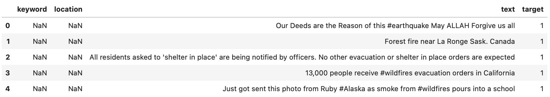
First 5 rows of the dataset.
It’s a fairly small dataset with around 7600 samples. There are missing values in both the keyword (<1%) and location (>33%) column, which we can replace with something as simple as no_keyword and no_location.
There are a total of 110 duplicate tweets, with some labels not being consistent between these. This may cause problems during model training as the model won't know which label to trust. We could look up all the duplicate tweets individually and correct their labels. However, for the sake of this example, I will go with a more simplistic approach and drop them.
Clean up the keyword and location columns
The keyword column contains over 200 unique words, while the location column make up of more than 3300 different locations. Displaying the top 15 highest counts for each results in the following.

Counts of each group in the keyword and location columns.
We can replace strings such as %20, which seem to be the only undesired characters, with a space in the keyword column.
The location column is very inconsistent; sometimes it refers to a continent, sometimes a country and sometimes a city. Additionally, there's nonsense data such as World Wide!!, Live On Webcam and milky way (not shown in the plot though).
The column is probably not so useful in its current state. There’s a lot of things we can do to extract more meaningful information from it, but one simple approach is to use a library to extract real cities or countries and use that as input to our model. This library will probably make several mistakes (such as not recognising a city name, or falsely interpreting an abbreviation as a city or country name), but it might still be better than what we have now. Depending on how much time we want to spend on this, the result will likely vary. There are many libraries available for this, each with their pros and cons. I will use Geotext since it's comparably fast. Other, likely better, options are spaCy and geograpy3.
If several cities are found, use the first, if no city is found, get the country, otherwise fill with no_location. This is a very naive approach, but still shows what can be done in terms of extracting a location from a text. Other, perhaps more thoughtful approaches might be to map the location with coordinates or geographical areas instead.
This brings down the unique number of locations in the location column to 726 instead of over 3300.
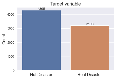
Target Variable
From before, we know that the target variable doesn’t contain any Nulls. As shown, it’s a fairly evenly distributed dataset with 57% belonging to the Not Disaster and 43% to the Real Disaster class. Had one of the classes been significantly over represented, we would need to take some measures such as applying over- or under sampling, or think more deeply about different evaluation metrics.
Feature Engineering
By cleaning the tweet text before extracting information such as the length of the tweet, number of punctuations, hashtags, etc., we might lose important information. For that reason, we will first extract additional features before cleaning the text. Having said that, it’s worth to experiment with the opposite approach as well.
We’ve already extracted relevant locations from the location column which we hope will improve the classifier. However, most of the useful information is probably contained in the tweets themselves. Perhaps, tweets that in general have longer words and fewer punctuations might be an indication for real disaster tweets.
There’s certainly a lot that can be done here, and I won’t do any thorough feature engineering other than creating some few features to display what can be done. For example:
- Number of punctuations in the tweet (!"#$%&\'()*+,-./:;<=>?@[\\]^_\{|}~)
- Tweet length
- Average word length per tweet
- Word count in each tweet
- Number of stop words
- Number of hashtags in the tweet
I’m using the string and keywordnltk libraries to get common punctuations and stop words in the english language.
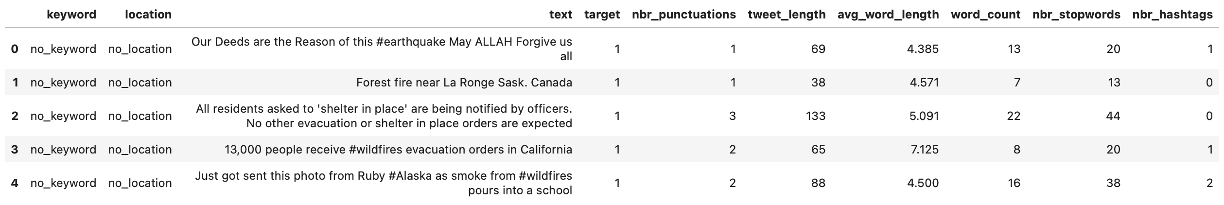
Applying that results in the following dataframe.
Now when we’ve used the original text to create some additional features, we can clean it up a little. Depending on what modelling approach we take, we might choose to clean the text more or less. For example, sequence models often do very well with only minor data cleaning, while bag-of-words models tend to prefer slightly more. We will only do minor text cleaning to keep it simple.
Visualise the distribution of the engineered features
In order to get a better overview of the features we just engineered, it’s a good idea to plot them. We can do that using histograms. By adding ranges to the title, we get a more exact overview of each variable’s distribution.

Takeaways from above plot:
- We note that, in general, the distributions are pretty similar among both Not Disaster and Real Disaster throughout all variables. The exception might be avg_word_length, where Real Disaster in general seem to have longer words. This might perhaps be explained by that news papers and journalists are posting about real disasters more frequently, and they might be using less slang and more sophisticated words than the general public. However, the difference in distribution should be verified using statistical methods such as a T-test or Kruskal-Wallis.
- Most variables seem to be non-normally distributed. The exceptions might be word_count and perhaps nbr_stopwords. This, again, should be verified using statistical methods such as a Normaltest or Jarque-Bera.
- The most frequent tweet length is around 140 characters, while the longest in the dataset is 157. 99% are shorter than 143 characters. Real Disaster tweets might be slightly longer on average. A plausible explanation could be the same as for the difference in avg_word_length.
- Most tweets have no hashtags and rather few punctuations.
Correlations
In order to get a better sense of which of the engineered features contribute most to the target variable, we can calculate the Pearson correlation and display it in a matrix.
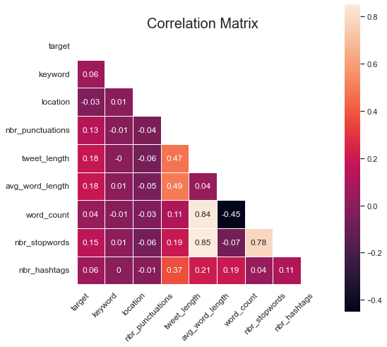
Several of the features have a (positive) correlation with the target variable, where the tweet_length, avg_word_length, nbr_stopwords and nbr_punctuations are the strongest. In general, as the value of these features increase, the probability for a real disaster also increases.
location has a very weak (negative) correlation with the target. While disasters can strike everywhere, there's probably more that can be done to extract valuable information from this feature.
In general, there seem to be little multi-correlation between features. That’s good, because if it becomes too high, it might negatively affect the model performance.
It’s important to note that above correlations only take each variable into account separately. It’s possible that two or more weakly correlated variables might be very important together if combined.
Model Fine-Tuning
There are two main approaches we can take when building the classifier; 1) a more traditional bag-of-words model (often machine learning), and 2) a sequence model (i.e. deep learning). The Transformer architecture is probably the most popular sequence model for NLP today. Depending on the size of the dataset, tweet length and perhaps the importance of context in the tweet, each approach may have its advantages.
Although we ideally should evaluate both approaches, I will choose a Transformer model approach to keep it simple. I’m also suspecting that it’s important for the model to understand the sentence context and its meaning in order to perform as well as possible on the task. Transformer models have a tendency to perform slightly better in such situations. I highly encourage you to read François Chollet’s Deep Learning with Python, 2nd Ed. to learn more about this and Deep Learning in NLP in general.
Although BERT might be the most famous Transformer model out there, I will choose an ALBERT architecture instead. It’s in many ways similar to BERT and differ mainly in that it shares parameters across layers. This leads to a lighter, faster to train and often more performant model. To save training time, we will additionally choose a smaller ALBERT architecture. Obviously, we will need to train the model on a GPU. GPUs often gives at least 10x speed-ups compared to CPUs for tasks like this due to parallelisation.
Although some of the features showed little correlation with the target variable, I will use them all. They might play more importance when “working” in combination with the other features. Additionally, they take up little space compared with the tweet text itself.
A very naive model that only predicts the largest class each time would get 57% accuracy. This will thus be our target to beat.
First of all, we need to split the dataset into train and validation splits. Although we already have a test set, we can’t evaluate the model on it because it doesn’t have any labels. We should therefore split the train set into an additional third set; a test set. However, since the dataset is fairly small, we would likely need to implement cross validation in order to accurately assess the model performance. This will take quite a lot of time though (training a model once takes around 20 minutes on a free GPU, with 10-fold CV, we would spend over three hours on it, or 200 minutes). Although suboptimal, we will thus evaluate the model performance on the validation set only.
One way to prepare the data for a Transformer model when there’s both text, categorical and continuous columns, is to combine them all into one single column and separate them with the [SEP] token. We can also include this step in the pre-processing pipeline. In order to more clearly display the results, I will go with the first approach.
Using 🤗 Hugging Face’s TabularConfig object also works very well when combining structured and unstructured data.
Applying above and selecting only the resulting features (which are now all in the same column) and corresponding target, yields the following. Note how each individual feature is separated with the [SEP] token — a standardised token used in ALBERT.
![All features combined with a [SEP] token separating each.](../images/fine-tune-transformer/final-dataset.png)
Pre-processing Steps
The ALBERT model needs some further pre-processing of the data. Among other things, each word needs to be tokenised while the sentence needs to be trimmed to the same length. The pre-processing step is downloaded from TensorFlow Hub and we can then combine it all in the following function.
Build the Model
Next, define a function that leverages a pre-trained ALBERT model base. Make sure that we allow fine-tuning of it by specifying trainable=True and stack a single Dense layer on top which outputs one of two classes; 1 or 0, representing disaster or non-disaster. Additionally, we can use a commonly used Adam optimiser that often works great out of the box.
To get a more holistic picture of the model’s performance, we measure three metrics; accuracy, precision and recall apart from the loss. We are extra interested in precision and recall since those metrics tell us how well the model classifies real disasters.
The resulting ALBERT model has 11.7 million parameters and looks as follow. Note the three inputs the model is expecting, the pre-trained model in the middle and the single output layer.

Data Loading and Model Fine-tuning
Create a function for loading the dataset into the model in batches. It’s important to load the data in batches for memory reasons. Although it could be possible to load this rather small dataset into the GPU memory directly, a solution like that wouldn’t scale well as the data grows larger in size.
Next, we will specify model parameters and path, create the preprocessing model for data preprocessing and load the data in batches. We can use a seq_length of 145 characters to capture the whole length of over 99% of the tweets (143 is enough as we saw before, but 145 is a more even number). Longer sequence lengths lead to longer training times, but also potentially more performant models because more of the information in the tweet is captured.
Specify a model checkpoint that saves the best model based on validation accuracy during training. That way we can easily access the most performant model afterwards. Although a metric such as the F1 score might be more in-line with our goal, we will use validation accuracy as it’s easier to understand.
Lastly, initiate the model training/fine-tuning with previously defined parameters. Since we actually are fine-tuning the model, we don’t need, nor should, train it for long. I choose 5 epochs as it doesn’t take too long while it also seem to be enough for the performance to flatten out. Depending on the GPU you’re using, this will take different amount of time. In my case, using a free GPU, it took around 20 minutes.
Analysing Model Performance
To get a holistic view of the model’s performance after each epoch, we can plot each metric at the end of each epoch on the train and validation data.
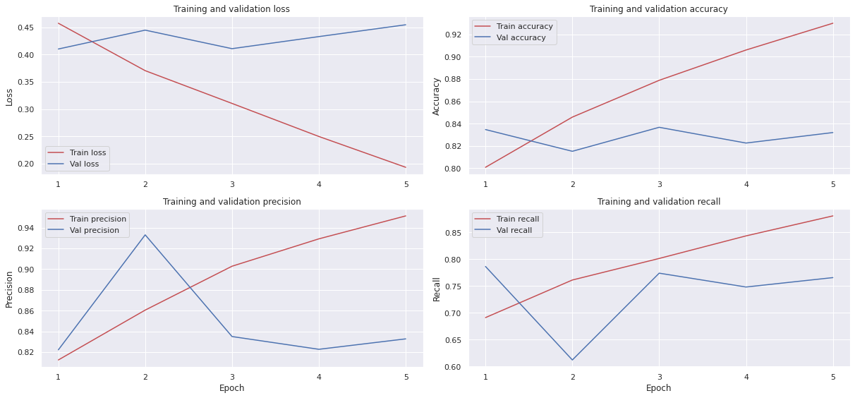
Focusing on val_accuracy, we note that there’s a peak after the third epoch before it then declines slightly. It’s a fairly small dataset and we are only fine-tuning the model. Chances are that it starts overfitting after the third epoch even though we’re using a low learning rate which results in larger differences between the train and validation set in later epochs.
By loading the best performing model after three epochs, we can take a deeper look into its performance using a confusion matrix and a classification report.
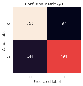

We see that the model is doing fairly well in correctly predicting both real disasters and non-disasters. It correctly identifies 494 of the 638 disasters while also correctly identifying 753 non-disasters (out of 850). It does seem to do a little worse on real disaster tweets though. Although there’s surely still room for improvements, this first model does fairly well.
We could move forward by looking into the tweets the model fails on. The tweets might even be very hard for a human to correctly classify, they might have incorrect labels in the first place etc., which will negatively affect the model’s performance. There might also be a pattern among the tweets it is miss-classifying. If so, we could collect more tweets like that to improve the performance. As of now though, we’re happy with these results.
Summary
Although there’s certainly more we can do in terms of building more features, experimenting with various text cleaning approaches, using more powerful models, analysing the results etc., etc., we’ve already learned some interesting things when fine-tuning Transformer models on both structured and unstructured data. Here’s a short summary of what we’ve done:
- We’re only working with the train set since the test set doesn’t contain any labels. This results in around 7600 tweets.
- We only apply basic cleaning to keep as much as possible of the original information. For example, tweets that contain many spelling mistakes might less likely be written by journalists, and thus possibly less likely to be about real disasters. We use a third-party library to extract and normalise the locations in the location column. Much more work can be done on this though.
- We created a couple of new features in the hope to better separate the two classes. Although much more can be done here, we experimented with some new features such as nbr_punctuations, tweet_length, avg_word_length, word_count, nbr_stopwords and nbr_hashtags.
- Initial visual observations indicate that the distributions between the two target classes are fairly similar for the created features. The exception might be avg_word_length, where Real Disaster in general seem to have longer words which we hypothesised perhaps more frequently are written by journalists.
- The most frequent tweet length is around 140 characters, while the longest is 157. 99% are shorter than 143 characters.
- We use a pre-trained ALBERT base in our model to leverage its embeddings and to speed up training.
- By combining both structured (the engineered features) and unstructured data (the tweets), we attempted to boost the model performance.
- Even though the model does slightly worse on real disaster tweets, an accuracy on the validation set of close to 84% is achieved.